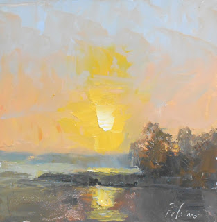
I've always gone back to a limited palette from time time when I feel it's time to strengthen my skills again. I experimented with this particular combo on some of my sunrises. I wanted to try exploring this limited palette to see if I could get more harmony in my work. I feel as though it is taking me back to focusing on using temperature changes and how the more de-saturated tones help the saturated colors have stronger effect. I also think that it forces me to focus on other things that need improvement in my work, like composition, shapes and value...once I don't have the distraction of "color matching".
So here are some of the results and I hope you will give it a try as well! (If you use social media use the #blackandorangepainting so we can follow along).
I was really amazed how just Ivory Black + White looks so blue among all of the other orange and yellow tones....and vice versa. Here are a couple of examples:
The greens in this one were just made with Ivory Black & Cadmium Yellow
Again the colors that were achievable in this one amazed me too. I love how Cadmium Orange looks so pink with just a little bit of white and it looks purple with a little bit of black and white.
This one was done with a little bit different combo, I just substituted the cadmium orange with Burnt Sienna. The Sienna is transparent and does not look so cupcake pink as the orange. I loved the warmth and luminosity of this one.
On these two I substituted black with Burnt Umber + Cobalt Blue.


Outstanding. Kelli you are always a delight.
ReplyDeleteBest,
CA
Fun experiment- nice work!
ReplyDeleteKelli i just posted my attempt...it was my second one...the painting is better than the photo...really enjoyed the workshop.
ReplyDeleteCA